Have you ever created a design that you thought was awesome, but when you showed it to someone else, they struggled with comprehending the information? Maybe, it was because the font was too small for them to read, or the colors were blending together making it difficult to understand.
Sometimes we forget that not everybody sees the world as we do for a variety of reasons. When creating a piece to be informative and useful for everybody, it is important to take time and review your choices of colors, fonts and layouts.
Consider these guidelines when making choices for your design to accommodate people with vision impairments from things like age-related vision loss to color blindness. Those same guidelines are useful for designing pieces that can be utilized by people with dyslexia and those on the autism spectrum.
I have broken down this thought process into three categories. Once you know the basic ideas of these three categories, it is easy to add these principles along with color theory to create a successful design for almost anyone.
Color combinations and usage
- Use strong contrast.
- Be thoughtful when choosing color combinations.
- Utilize more than color.
We all know that as we age, we experience some form of vision loss. An interesting fact you may not know is the lens in your eye begins to yellow from birth. This is the reason it is harder to distinguish greens and blues as you get older and, with your pupils becoming smaller, colors can look darker or less saturated. The same is true with people who are color blind. It is not that they do not see color at all. Colors simply look less vibrant and may blend in together. The solution is to use strong contrast and avoid problematic color combinations. Color combinations to avoid for color blindness are green and red, green and brown, green and gray, green and black, blue and purple, blue and gray and blue and green.
Another solution is to use more than color. When we rely on colors only for our design such as a map or infographic, those that have difficulty distinguishing colors from another may not be able to understand the information. By adding text, icons or texture in addition to color, you are adding another layer graphically to communicate to everyone.
Font choice and size
- Review the size of text for readability, not just style.
- Choose clean, simple fonts.
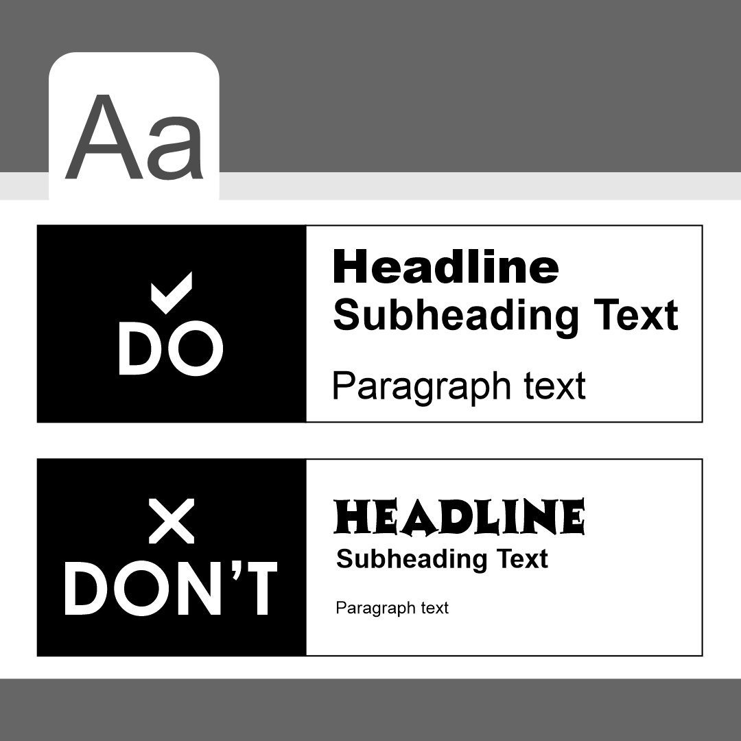
Along with color issues as we get older, font size can also become an issue. I can’t tell you how many times I have had to take a picture of small type on a box to blow it up for readability or have asked one of my children to read it for me. I would not put that design in the win column. Our goal should be to benefit the reader. If you cannot communicate the information because of small type, it is a failure no matter how beautiful a piece may look.
That covers readability, but we must also look at legibility. It is important to use clean, simple fonts. It may be tempting to use a fancy font with flourishes to evoke emotion into a piece. The result, however, for many readers, is a distraction instead of an embellishment.
Layout and presentation
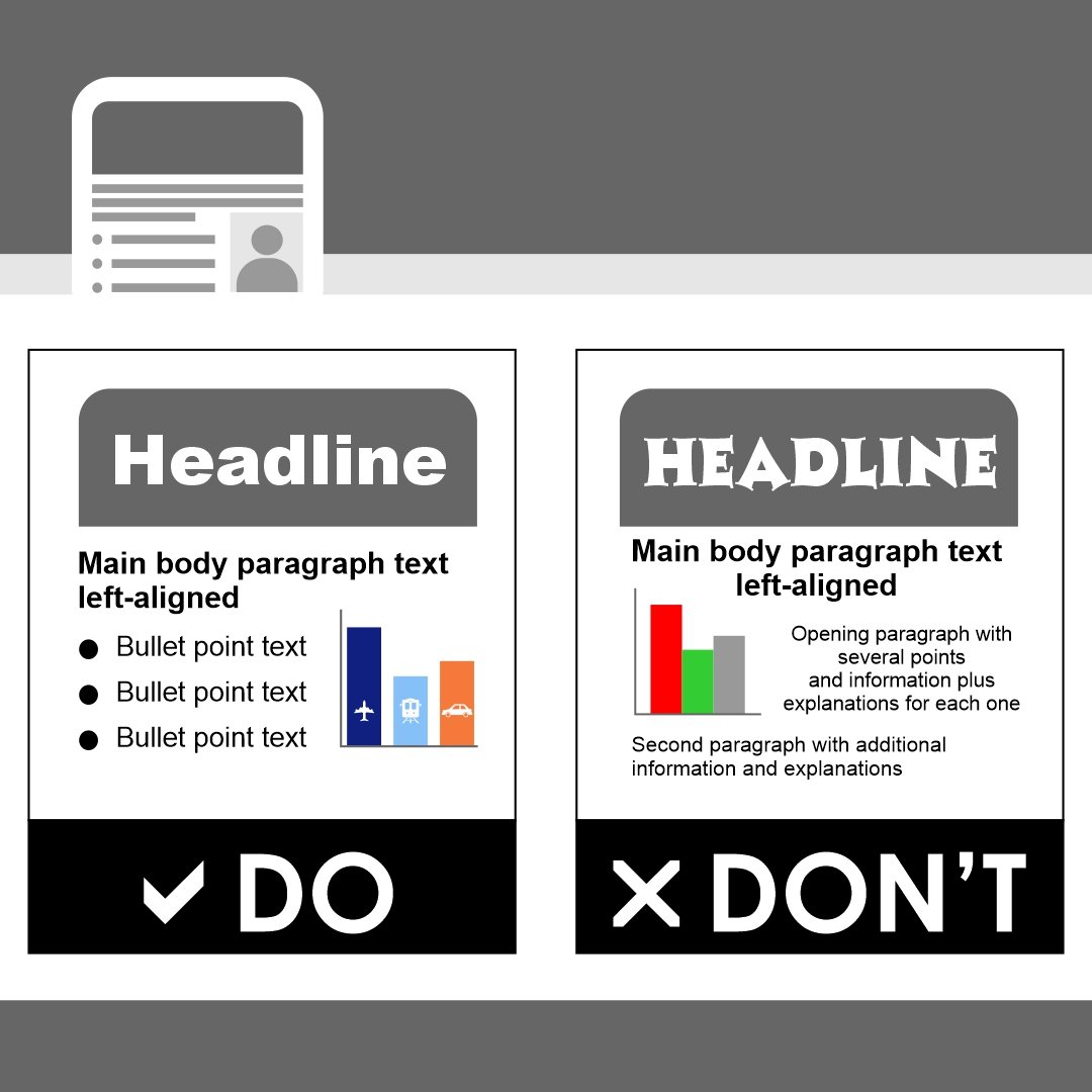
- Use simple and consistent layouts.
- Apply negative space.
- Write in simple sentences using bullet points.
Keeping a layout simple and consistent is always a good practice. When people look at a page with graphics and text, their eyes automatically want to create shapes. This can be created either by suggestion with the way the items are placed together or with an actual box drawn around the components. Structuring a page in this way makes the reader less likely to miss any information you are trying to convey.
In addition to creating shapes in the design, applying negative space, or white space, helps remove the clutter, especially for people with dyslexia and autism. It essentially gives our minds a rest and reset from each block of information.
In design pieces, the text needs to be minimal and created with simple sentences. Making the text aligned to one side or the other and being consistent in that alignment cuts down on confusion. A small amount of text plus bullet points can go a long way in making the biggest impact on a much larger audience.
Read more articles like this, like Tips to Work with a Creative Agency, to learn more about how to create dynamic graphic design.